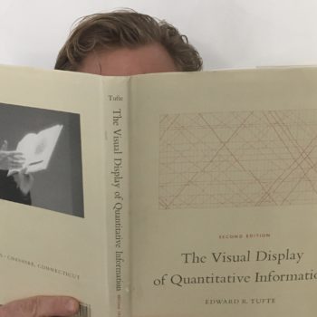
How strongly do I recommend The Visual Display of Quantitative Information?
8 / 10
Review of The Visual Display of Quantitative Information
Software engineers who take pride and pleasure in identifying and calling out misinformation will enjoy this book.
This book is 80% visual examples and 20% text. I found two ways to read The Visual Display of Quantitative Information:
- Fast, skimming over the visuals and appreciating their beauty
- Slow, analyzing the visuals and trying to understand Tufte’s points. I recommend this approach because as you go along you will find yourself wondering, “Wait, will Tufte say this is a good example or a bad example?”
About half of Tufte’s examples come from professional designers, the other half look like graphs produced by Excel.
Honest graphics compare data
Tufte dedicates an entire chapter to graphical integrity, showing many examples of how graphical representations mislead readers. The visuals vary widely, from examples you’d see produced in Excel to custom graphics from designers.
A common theme among dishonest graphics is the failure to answer, “Compared to what?” These are lies of omission and tie back to the crux of the problem:
We use visuals to make data feel interesting and we’re often willing to sacrifice integrity for intrigue.
What is chartjunk and how do I avoid it?
Chartjunk is graphical paraphernalia added (often automatically) to our visuals:
- Excessive grid lines
- Clunky or unnecessary axis ticks
- Bar and area fill patterns
However, removing chartjunk is easier in theory than practice. As software engineers building apps with data graphs, we’re often relying on third party libraries like Chart.js and Highcharts because they get us 90% there with little fuss.
But to produce the kind of charts that Tufte would be proud of, we often need to drop down to D3 and also build some logic to handle scales and data variability within our graphs.
Excel and Google Sheets practically invite you to add chartjunk and it’s your responsibility to remove it.
Elegance is simple design representing complex data
Just like the iPod’s initial design, elegant visual graphics hide complexity and make the data more approachable.
Conversely, many poorly designed graphics add visual complexity onto simple data.
Data-ink maximization
Tufte presents a series of graphs, then step-by-step removes chartjunk. As he removes unnecessary elements, the visuals all increase in clarity, beauty, and in data-ink maximization – in other words, how much ink is required to convey the information.
